For those of you without cable, this may come as a bit of news, but the NBA is back in full swing. And while some people are tuning in to watch the games, the only contact I've had yet with the NBA has been on Sportscenter. Through my chance encounters I've noticed a number of teams that have updated or in some way changed their uniforms. Most of these changes I actually like, which is unusual. Below are the changes that I am aware of. There may be more that I'm not aware of, and if so, please let me know.
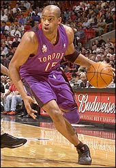
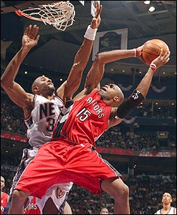
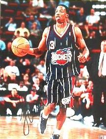
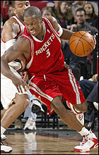
 Note that both Houston and Toronto have embraced red as a new primary color. This is the opposite of a trend in the NFL, which has seen teams wear a lot of very dark, very formal blue. The Rockets uniforms, changed primarily because of the increasing popularity of Yao Ming, were designed by the same person that won an Oscar for costume design on Bram Stoker's Dracula. They are suppossed to highlight the upward motion that is unique to basketball. The Raptors, on the other hand, have changed in order to embrace the fact that they are the only team in Canada. This comes at a time when the Blue Jays seem to be eschewing their Candaian roots and are rumored to be forgoing any hint of the maple leaf on next years uniforms or logos. Whatever the reason, I'm just glad they got rid of those dreadful two-toned purple and black numbers.
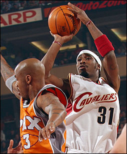
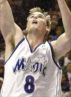
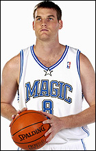
Also note that the Magic have done away with any pinstripes or stars. They will wear blue on the road with the word "Orlando" above the numbers. This is an effort to show their loyalty to their town, so my guess is they're angling for a new arena. The Nuggets made a similar move on their road jersey. It's also worth noting that Toronto has put "Raptors" on their road jersey, in the hopes that they will be embraced by the whole of Canada. Cleveland and Houston kept their city's name on their road jerseys.
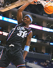
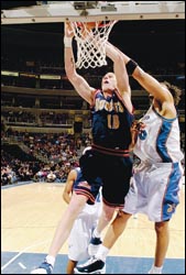
The Cavs (who seem to be trying to get away form this abbreviation) and the Nuggets see uniform changes as a result of highly touted rookies joining the team, Labron James and Carmello Anthony respectivly. The Cavs have gone to a wine and gold and added a C-sword logo, which I think is pretty snappy. Also, although it's hard to tell here, the Nuggets have gone the way of the old San Diego Chargers and are embracing the powder blue and yellow. Again, another change I like.
I've included the following pics so that you could see the new uniforms compared to the old. Also, note the Phoenix Suns' new alternate uniforms, which are orange and silver with the letters "PHX" above the number.

 A couple of the teams listed above changed their logo as well, including the Raptors going to a claw for their secondary logo and the Cavaliers new C-sword, which is reflected in the new uniform. However, the Rockets really improved their whole look by changing their logo to this snappy little number.
Well, that's all the logo talk for now, tommorrow: Hockey
Piece & Love,
Tony
