Sogol
The
Cincinnati Bengals have always faced a bit of a logo dilema. Although their signature black bengal stripes on orange helmet is widely known, the team has struggled with a logo that can be put on hats, T-shirts and used by television networks. Previously, the Bengals, like their in-state homies the Browns, have simply used the image of their helmet as their logo. (The Browns, for a period, used a little elf-like guy, who was as cool as he was inexplicable.) The helmet image was everywhere. It was in the middle of the field, it appeared on hats and usually on television. But as revenue from logo-generated sales became increasingly important, the Bengals continued to try knew things.
 The middle of their field (in relatively new Paul Brown Stadium) is now occupied by a full-bodied bengal tiger. The detail from that logo, the Bengal face on the left, is often seen on hats on merchandise these days. But, perhaps in a move to increase literacy, the Bengals have unveiled a new logo. This block letter "B", in orange, with bengal stripes.

Personally, I think this looks like something I did using WordArt on Powerpoint. But I applaud the Bengals efforts at revitalizing their sorry franchise with a new logo. And don't underestimate the effects that a new logo, like a new facility can have on a team.
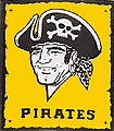 Is there any doubt that the Pittsburgh Pirates slide into Bengal-like ineptitutde was brought about by their dumping of the modest, but serious-looking "Doug Drabek" Pirate? This, after they had already gotten rid of the very 70's (and uniquely cool) Marlboro Man logo. The Bucs did themselves no favors by replacing the "Doug Drabek" guy with a new garish, needlessly ferocious Pirate -- a logo which included the newly added color red, another source of the Pirates current woes.
 There's little doubt that the sports gods are fashionistas. My prediction that the black on green "outfit" that the Eagles put together before the playoffs would end in disaster held true. And in keeping with that bold predictions, here's how I see this year's baseball season.
 The Orioles's will be rewarded for bringing back orange as their script color, which will help to make the orange bills on their home hats look less ridiculous. As the O's rise, the Blue Jays will falter because of their efforts to distance themselves with Canada, losing the maple leaf and any hint of red. The Reds and Mets will continue to struggle as long as they insist on using black as a main color in their uniforms. And finally, the Padres should look and play good this year, thanks to a new, fresh approach to away uniforms -- sand rather than gray.
So, as the baseball season gears up, and training camp cruely remains months away, just know, dear reader, that there's always someone here at We Three Jerks keeping tabs on the evolution of sports logos.
There, now won't you sleep better tonight.
Tony
Posted by thynkhard
at 3:37 PM EST
Updated: Wednesday, 31 March 2004 4:23 PM EST
 From the Baltimore Sun:
 If you are one of those people who finds late night talk shows beneath you, you've been missing a mini-firestorm surrounding the
 Another round of applause for Thomas DiBiagio, who has made like
 Giant and Safeway grocery stores throughout the Baltimore-Washington metro area
  Western Maryland makes an appearance in today's